Daniel Dekel
-
Posts
1,385 -
Joined
-
Last visited
-
Days Won
66
Content Type
Profiles
Forums
Enhancement Requests
Everything posted by Daniel Dekel
-

bug Radioset in Custom Form has incorrect formatting
Daniel Dekel replied to samwoo's topic in Employee Portal
Sure @samwoo, Will look good soon ;-) Have a good day, Daniel. -
Hi @Martyn Houghton, The initial text has a max of something like 100 characters, but the chars is counting is after stripping out the wiki markup signs. So is based on pure text. Cheers, Daniel.
- 6 replies
-
- 1
-

-
- employee portal
- wiki
- (and 2 more)
-
Hi @Berto2002, Thanks for your comment. Our next build will have a button with a bigger hit area. Regards, Daniel.
-
Hi @samwoo, Thanks for the correction. At the moment validation messages do not have translations. We'll fix this and will be available in the next (or second next build). Regards, Daniel.
- 1 reply
-
- 1
-
-
OK @Martyn Houghton, The change was done and will be available probably in the 2nd next build (the next one already built). Using wiki in a list is not that straight forward. WiKi can contain line breaks, different text size, etc. So, the solution is as follows: 1. The description in the list will be displayed as plain text with an option to show the full wiki text. There is a visual indicator for that. after clicking: 2. If there is more text to show (because is too long) it will show the "Show More" option 3. Changes had been made also to the Search Widget to reflect wiki text. Sorry for the ugly colours ;-) is what we use to test the customizations. If you find further issues please let me know. Kind regards, Daniel

- 6 replies
-
- 1
-
-
- employee portal
- wiki
- (and 2 more)
-
Best way to display Images in the employee portal
Daniel Dekel replied to Adrian Simpkins's topic in Employee Portal
Hi @Adrian Simpkins, At the moment the background image stretches proportionally to use the entire width of the browser's window. So depending on the screen's resolution and window size the image can hide some of the details. We can look in to adding restrictions on the width. That will mean that in some cases the image's width can be smaller than the window width and there will be empty space. It can be filled with the background colour. So the image won't be cropped as it is now, but it might not look very nice. Let me know if you want this option and we can investigate on an implementation. Regards, Daniel. -
Hi @Martyn Houghton, Yes, we'll look at this. Regards, Daniel
- 6 replies
-
- 1
-

-
- employee portal
- wiki
- (and 2 more)
-
Displaying Draft Page Designs in Design Mode
Daniel Dekel replied to SJEaton's topic in Employee Portal
Hi @SJEaton, I can see now the problem you might be facing. When in Page Manager, you change the visibility of the page but if you click on the "Design Widgets" button it doesn't send the visibility option you've selected and you end up needing to switch the visibility manually. We'll take care of that issue. It will be available for our next build. I know the copy widget has been requested in the past and I know it will save quite a lot of time when designing multiple pages. We have that in our list since then, but is not as simple as it sounds to implement it and also we have other changes in our backlog. Hope we'll soon get to this. Regards, Daniel. -
Issue with how page designs display when exiting design mode
Daniel Dekel replied to SJEaton's topic in Employee Portal
Hi @SJEaton, I've answered in the original post. Regards, Daniel. -
Displaying Draft Page Designs in Design Mode
Daniel Dekel replied to SJEaton's topic in Employee Portal
Hi @SJEaton, The problem was solved back in March. To make sure we are talking about the same issue: When in Page Manager open a page and click on the button "Design Widgets" The page used to open with the wrong version What is important for you to understand is that when you edit the page it saves all changes to a Draft State (version). Only you see that draft state when you design the page. But when you or anyone else opens the page normally you will see the published version. That is to allow you to design the page as long without impacting the customers. That is why when you exit the design mode it shows you the original published version. The draft mode is saved for when you enter that mode only. If there is still something wrong, could you please send me the replicating steps for the issue? Thank you, Daniel. -
Hi @Vikki Cameron, We are working on this but is not ready yet. Is going slow because other higher priority changes come all the time and this is a big and time consuming change for us. Again, we didn't abandon this but is going slow. Will keep you updated. Regards, Daniel.
-
Hi @derekgreen, There are a few causes for this. The page hasn't been published yet - Means is still in draft mode, so only you can see this or other page administrators The user has a lower visibility than that page is set to - For example if the page is set to "User" and the logged in user is a "Basic User" the he will see this message. Hope one of these cases will solve the problem, if not let me know and we'll investigate further. Regards, Daniel.
-
Hi @Andy Woodley, Sorry but is not possible to remove the sidebar. Regards, Daniel
-
Hi @SJEaton, I can see the problem. There is some special case for the last row, but if you use the "Use content height" it should apply that. I'll make sure this is fixed ASAP. Thank you, Daniel.
-
Hi @Kelvin, Thank you for the examples. There are differences if you use 3 or 4 columns. 4 uses the entire width of the page making it impossible to have another widget next to it. In that case (full width) it can use a smaller height. When it has 3 columns, it will usually have a widget next to it and in that case the layout will attempt to set the same height to all the widgets in the row. That's why you see the difference. You can still force it if you want by selecting the "Use Content Height" in the Style tab if the widget config. Let me know if it worked for you. Regards, Daniel.
-
Hi @Kelvin, Can you please clarify a bit more how to replicate? In your first screenshot (4 cols) the first link takes the entire width. What is the configuration of that link? Because I can also see that is the only one that doesn't have text on it. The 2nd screenshot has an icon on the right hand side, is that part of a different widget? Thank you, Daniel.
-
Hello all, Wanted to inform you that we just made a patch to solve the issue with the time and date order. Can you please confirm it works? Thank you, Daniel.
-
Displaying Draft Page Designs in Design Mode
Daniel Dekel replied to SJEaton's topic in Employee Portal
Hi @SJEaton, Yes, I can see this is happening. Is definitely not a feature ;-) I'll raise a defect for this. Regards and thank you for reporting, Daniel. -
@Nikolaj, thanks for the info. I can see that the user has a Basic User Role, so he's a Basic User, right? Basic Users can't see Co-Workers. But at the same time I see he has management roles like Asset Manager. Either that or he should not have the basic user role, instead he should have the Collaboration Role. Regards, Daniel.
-
Hello @Nikolaj, Can you see the Co-Workers option in the navigation menu or is it only in the global search the problem? Regards, Daniel.
-
Hi @Vikki Cameron, Sure I'll let you know. It can take some time because it requires many changes in different ares of the product. Regards, Daniel.
-
Hi @Vikki Cameron, I meant that we will be looking into adding a new option for High Contrast per user. That should improve the overall colour scheme for people with visual impairment. This will bring us closer at least in regards to the colours to the WCAG AAA conformance requirements. What we can't do is allow each user to change the font size or colours he wants. But we will provide colours with enough contrast to help. Regarding the font size, I suggest using the browser's native Zoom level, which will allow the user to increase to whatever size he wants. I'll keep you informed when this is ready. Regards, Daniel.
-
Hi @Vikki Cameron, The problem is that with one long list, you (everybody) will start seeing scrollbars if the list of services has many items and that is even worst for accessibility. Dark Mode is a flag you can turn ON/OFF in the profile view. You need a modern browser for this (not IE11) and set dark mode in your OS (Windows or Mac). It might not be relevant for accessibility so much, but that's where the high contract option could be added. Thanks, Daniel.
-
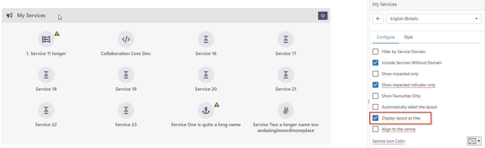
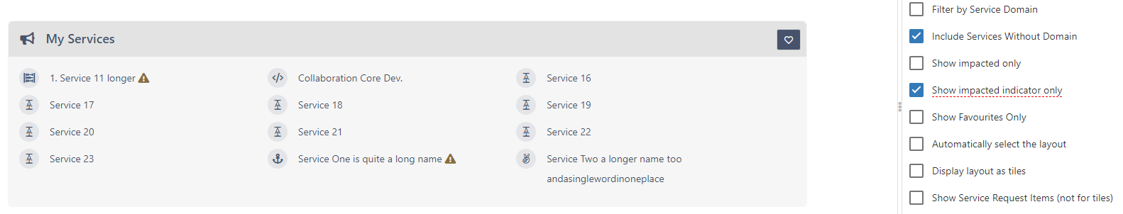
Hi @Vikki Cameron, Regarding the layout of the Services widget, perhaps if you change the layout to list it will help? In the widget configuration uncheck the "Display layout as tiles". It should display it as a list Regarding the colour contrast, will it help if we add an option, similar to the Dark Theme (if you've seen this) that will set all as Hight Contract? That will be set by user only for accessibility purposes. Thanks, Daniel.
-
@Vikki Cameron can you please provide some more details about where is the problem? Is the user using a screen reader? Thank you, Daniel.