Daniel Dekel
-
Posts
1,383 -
Joined
-
Last visited
-
Days Won
66
Content Type
Profiles
Forums
Enhancement Requests
Everything posted by Daniel Dekel
-

Preview new User Interface for Core UI
Daniel Dekel replied to Daniel Dekel's topic in Collaboration
@Berto2002 That also didn't change. The way it works is... Several views that do have an option to search will switch the search context to it, for example requests list will switch to "Request Search". Workspace will switch to "Workspace Search". There are views that don't have search and in that case the search context will be left unchanged. So if the last view was "Requests List" the search context was "Requests Search" and if you switch to a board, the search will be left with the last one; "Request Search". The default search that will come up if there is no search is "Co-Workers Search", that's why you get this. But again, this is the same as the old view. Hope is more clear now. Daniel. -
Hi @samwoo, I understand. I'll add it to our list, but it won't be quick as we have higher priorities on it. But I'll keep you updated when is done. Thanks, Daniel. P.S. I moved this post to the Collaboration forum.
-
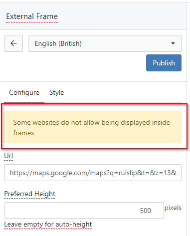
External Frame 'Refused to Load :( '
Daniel Dekel replied to Ann-MarieHolloway's topic in Employee Portal
Hi @Ann-MarieHolloway, Not all websites allow being displayed inside frames. Please see the message in the widget itself. The sad face icon you see in the widget is coming from the browser itself as a result of this same point. Regards, Daniel.
-
Preview new User Interface for Core UI
Daniel Dekel replied to Daniel Dekel's topic in Collaboration
Hi @Ruben, The issue has been fixed in our latest build. Regards, Daniel. -
Preview new User Interface for Core UI
Daniel Dekel replied to Daniel Dekel's topic in Collaboration
@Emily Patrick, @Estie, By saying "Custom View" you mean pressing on the button "Make this my default view" ? If so, what view are you setting as default? Thanks, Daniel -
Preview new User Interface for Core UI
Daniel Dekel replied to Daniel Dekel's topic in Collaboration
@Estie we'll look at this. -
Preview new User Interface for Core UI
Daniel Dekel replied to Daniel Dekel's topic in Collaboration
Hi @Estie, We'll check the issues in dark theme for tasks. Thanks, Daniel -
Preview new User Interface for Core UI
Daniel Dekel replied to Daniel Dekel's topic in Collaboration
Hi @Berto2002, We'll fix this. Thanks, Daniel -
Preview new User Interface for Core UI
Daniel Dekel replied to Daniel Dekel's topic in Collaboration
@Daniel I think this will answer your question -
Displaying Draft Page Designs in Design Mode
Daniel Dekel replied to SJEaton's topic in Employee Portal
Not yet @Sam P -
Preview new User Interface for Core UI
Daniel Dekel replied to Daniel Dekel's topic in Collaboration
More answers: @Berto2002 - have you also noted and covered-off that the "dismiss all" button no longer closes the popout, so you just have to click the X in the top right as well. This is also an extra click from the previous UI. https://community.hornbill.com/topic/25439-preview-new-user-interface-for-core-ui/?do=findComment&comment=118757 [Daniel D] Fixed, available in our next build @billster - No Dark Mode for Workflows and Capture https://community.hornbill.com/topic/25439-preview-new-user-interface-for-core-ui/?do=findComment&comment=118767 [Daniel D] We are aware of the issue in the Employee Portal pages. The problem here is that most of the colours are configured by the customer, so when changing to Dark Mode, the colours remain the same. Unfortunately the solution I see here is to disable the Dark Theme just for Employee Portal. Or as an alternative is to do the same we do with email in Dark Theme, invert the colours. Regarding the Heads Up Display (Request Tracking) we are aware of this and already working on a solution. @billster - also can't see anything in entity explorer https://community.hornbill.com/topic/25439-preview-new-user-interface-for-core-ui/?do=findComment&comment=118768 [Daniel D] We'll check this out @will.good - When using DB Direct, if you Hide the Table List, the Clear Execute Query and Execute Selected Text do not fit to the site of the screen... https://community.hornbill.com/topic/25439-preview-new-user-interface-for-core-ui/?do=findComment&comment=118770 [Daniel D] We'll check this out @Art at BU - I just noticed this today. We see this overflow of grey on our homepage in the new UI for the search widget. Has anyone seen similar?https://community.hornbill.com/topic/25439-preview-new-user-interface-for-core-ui/?do=findComment&comment=118836 [Daniel D] Do you still see the problem? We can't reproduce this. -
Preview new User Interface for Core UI
Daniel Dekel replied to Daniel Dekel's topic in Collaboration
@sprasad clicking on the request ID should close the popup. We'll fix this. Regards, Daniel -
Preview new User Interface for Core UI
Daniel Dekel replied to Daniel Dekel's topic in Collaboration
Hi @Berto2002, This hasn't changed from the original style. I take this is a general request for a change. This style applies to all our forms, not only the request details view. I was looking to improve this bit because it has always been a problem especially for accessibility reasons. I'll add it but as a separate change request to our list. Regards, Daniel. -
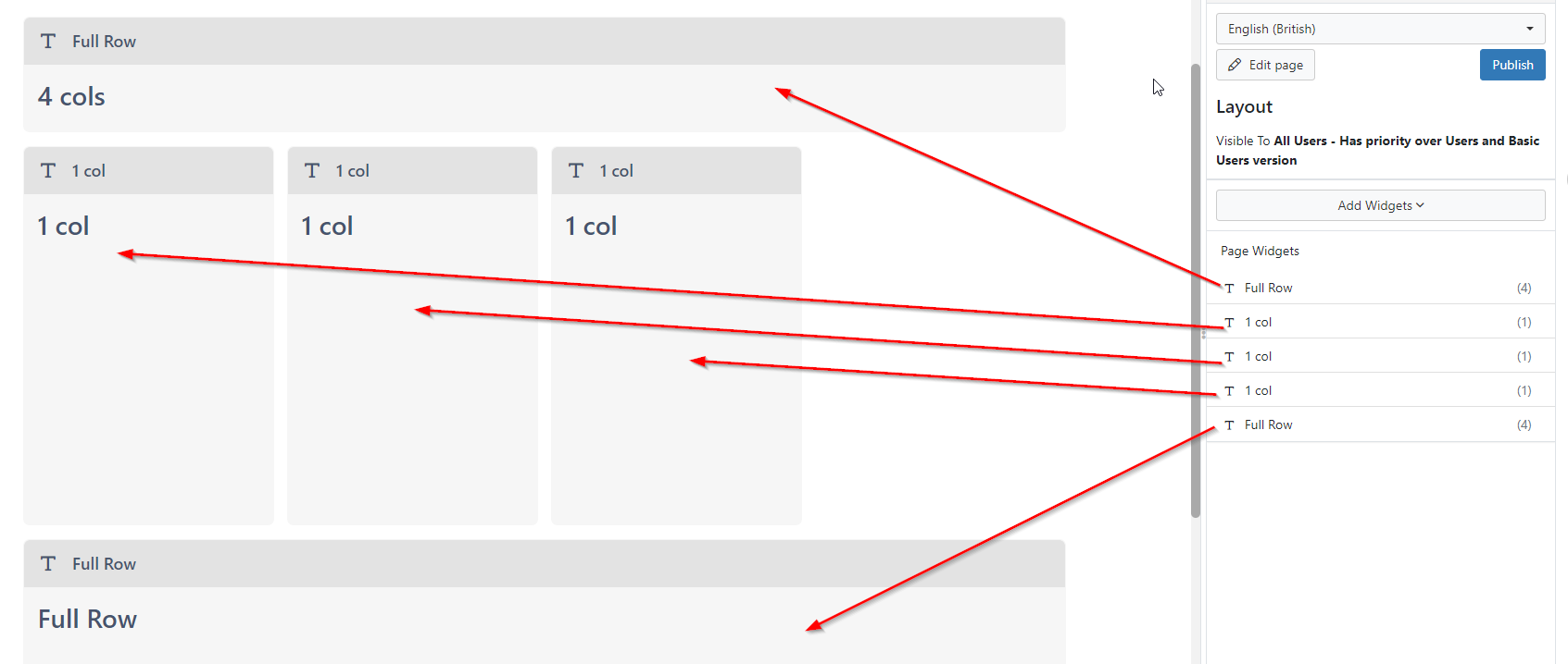
How to center icons in the customer portal
Daniel Dekel replied to Adrian Simpkins's topic in Employee Portal
@Adrian Simpkins that's what I imagined. The grid is based on 4 columns, so you can play with it. What you cannot do is align these columns to the centre because these need to be aligned to the original grid (top and bottom columns) Hope it makes sense. Regards, Daniel -
How to center icons in the customer portal
Daniel Dekel replied to Adrian Simpkins's topic in Employee Portal
Hi @Adrian Simpkins, I'm trying to understand how did you configure the layout of that page. I asume that each one of the items (Finance/Digital Services/People...) are added as an individual widget, is that correct? Similar to the example. From what I can see, it should be aligned to the left. The only reason it would look like is aligned to the right is if there is an extra widget taking one column space that is blank. Cold that be the case? Check in the widgets list what belongs to what and if there is one extra. Regards, Daniel
-
Preview new User Interface for Core UI
Daniel Dekel replied to Daniel Dekel's topic in Collaboration
Hi Estie, Please see my original post -
Preview new User Interface for Core UI
Daniel Dekel replied to Daniel Dekel's topic in Collaboration
Hello Everyone: Here are the responses for the latest comments: @MichelleReaney - Our default Change Request Intelligent Capture has a custom form to complete information and is only used in the analyst portal... https://community.hornbill.com/topic/25439-preview-new-user-interface-for-core-ui/?do=findComment&comment=118469 [Daniel D] We'll look at this issue @Adrian Simpkins - Another thing we have noted - if you view a board in the new UI, the text in the card displays aok, but then when searching text it inserts <ins>add</ins> in the found text https://community.hornbill.com/topic/25439-preview-new-user-interface-for-core-ui/?do=findComment&comment=118473 [Daniel D] We'll look at this issue @Berto2002 - Although we don't have this issue on cards that are added, updated and moved by the workflow https://community.hornbill.com/topic/25439-preview-new-user-interface-for-core-ui/?do=findComment&comment=118474 [Daniel D] We'll look at this issue @Emily Patrick - On our category end nodes, I've noticed the following, which while sometimes can be useful, doesn't seem to be as it should behave, as you can see by the picture below https://community.hornbill.com/topic/25439-preview-new-user-interface-for-core-ui/?do=findComment&comment=118481[Daniel D] I will give feedback to the Service Manager team, they should be able to fix the issue. @Emily Patrick - In relation to the above response to the new search option, I've clicked on the magnifying glass to search for a ticket, opened ticket from the results, all fine. I then went and put a different ticket reference into the URL instead of the search box, and when that page loaded the ticket, the search box was minimised again. https://community.hornbill.com/topic/25439-preview-new-user-interface-for-core-ui/?do=findComment&comment=118485 [Daniel D] That is true, but changing the URL manually will refresh the entire browser causing the search box to reset, exactly as in the original UI. @Estie - Morning we have received feedback that the difference visually between on hold and open tickets is slightly harder to see with the new view if you've opened them and they lose the blue highlight https://community.hornbill.com/topic/25439-preview-new-user-interface-for-core-ui/?do=findComment&comment=118487 [Daniel D] I will give feedback on this to the Service Manager team, they should be able to fix the issue. @Estie - We have had further feedback from a user as below. I have given some alternative suggestions - however is this something you may consider adding? https://community.hornbill.com/topic/25439-preview-new-user-interface-for-core-ui/?do=findComment&comment=118507 [Daniel D] Thank you for your suggestion. I will give feedback on this to the Service Manager team. @7oaks - Is it possible to adjust the columns in the mailbox. The current version isnt too bad but the previous version is even narrower in the email list. I'd like all 3 adjustable if possible. https://community.hornbill.com/topic/25439-preview-new-user-interface-for-core-ui/?do=findComment&comment=118509 [Daniel D] I've mentioned in my previous post about reviewing the columns size and data: - "here are users who want to see more details to avoid clicking on each email. There are others who like the more compact view. We'll look into an option to show multiple display options - compact, normal, extended" -
Preview new User Interface for Core UI
Daniel Dekel replied to Daniel Dekel's topic in Collaboration
Hello Everyone: Here are the responses for the latest comments: @Adrian Simpkins - One thing i have had fed back is the copy request window doesn't show the whole name of the users found... https://community.hornbill.com/topic/25439-preview-new-user-interface-for-core-ui/?do=findComment&comment=118434 [Daniel D] This will be fixed in the next few Service Manager build @AlexOnTheHill - I've noticed that emails in the sent items now take up roughly twice the vertical space too... https://community.hornbill.com/topic/25439-preview-new-user-interface-for-core-ui/?do=findComment&comment=118436 [Daniel D] There are users who want to see more details to avoid clicking on each email. There are others who like the more compact view. We'll look into an option to show multiple display options - compact, normal, extended @Estie - custom forms the static radio set buttons for choosing options are misaligned to the text https://community.hornbill.com/topic/25439-preview-new-user-interface-for-core-ui/?do=findComment&comment=118442 [Daniel D] We'll fix this in Core-UI @Estie - Hi @Daniel Dekel Thank you for all the above responses. https://community.hornbill.com/topic/25439-preview-new-user-interface-for-core-ui/?do=findComment&comment=118443 [Daniel D] Paid users are not the free ones (Basic Users/Guest). Is a user that in the administration is set as Type:"user" @AlexOnTheHill - I checked self service to see if there were any changes and it looks like catalogue items can now overflow and have also been squeezed horizontally https://community.hornbill.com/topic/25439-preview-new-user-interface-for-core-ui/?do=findComment&comment=118446 [Daniel D] We'll fix this in Core-UI @EWA - We find that on number of screens the darkmode or high contrast - some text becomes invisible - for eample emilas https://community.hornbill.com/topic/25439-preview-new-user-interface-for-core-ui/?do=findComment&comment=118447 [Daniel D] Emails in Dark Theme were fixed in our latest build (today). The solution is similar to other email clients. It inverts the email content (except images) @EWA - The Feedback stars are not showing unless one hovers over it https://community.hornbill.com/topic/25439-preview-new-user-interface-for-core-ui/?do=findComment&comment=118448 [Daniel D] This will be fixed in the next few Service Manager build @Estie - Further to the above if you wish to look at anything before 2023 the process is not intuitive as you have to keep clicking on the year to get other years. https://community.hornbill.com/topic/25439-preview-new-user-interface-for-core-ui/?do=findComment&comment=118452 [Daniel D] I believe this is not related to the new UI as it still appears in the old UI. But I'll feed this to the relevant team. Thanks. @EWA - So we have our employee portal configure with some white text and therefore with the darkmode /high contrast the text becomes invisible. https://community.hornbill.com/topic/25439-preview-new-user-interface-for-core-ui/?do=findComment&comment=118453 [Daniel D] We'll fix this in Core-UI @AlexOnTheHill - The pattern of squeezing the display horizontally seems to be consistent everywhere I look. Here's how Intelligent Captures compare https://community.hornbill.com/topic/25439-preview-new-user-interface-for-core-ui/?do=findComment&comment=118456 [Daniel D] Although it appears in several areas is not something that can be fixed generically by is. We need to go view by view and fix this. We'll do thin in the various areas (core-ui and applications) @AlexOnTheHill - The user list suffers from being used in portrait mode in the preview https://community.hornbill.com/topic/25439-preview-new-user-interface-for-core-ui/?do=findComment&comment=118458 [Daniel D] We'll fix this in Core-UI @Berto2002 - Messy buttons when generating support passcode. Looks like it's caused by the width reduction/margins/spacing issues and causing wrap https://community.hornbill.com/topic/25439-preview-new-user-interface-for-core-ui/?do=findComment&comment=118463 [Daniel D] We'll fix this in Core-UI -
Preview new User Interface for Core UI
Daniel Dekel replied to Daniel Dekel's topic in Collaboration
OK, I understand now, thank you @AlexOnTheHill We'll look at this. Daniel -
Preview new User Interface for Core UI
Daniel Dekel replied to Daniel Dekel's topic in Collaboration
Hello All, thank you very much for your feedback. Since most comments were done in this same post, I'll try to answer the ones that were not answered yet. Overall I can see that most of the issues are related to extra spacing, in regards to that we are already working on resolving. Some of the spacing issues are generic and will be fixed in the next few Core-UI builds and some are specific to the pages like the Request View, that will be shipped as part of the Service Manager build. The answers: @samwoo - On the Profiles screen in Platform Configuration, there are no tree-view style indents to show the hierarchy within the Request or Closure Categories. [Daniel D] We'll look at this (Don't have a date yet) @Ruben - The contrast between text and background makes it quite hard to read when the tickets are unread. Emails sent to Hornbill are also completely unreadable. [Daniel D] Contrast in Service Manager - Requests List will be fixed in the Service Manager App (Don't have a date yet) The Email Contrast was fixed and will be released in our next Core-UI build. @Estie - ...in the preview the actions toolbar at the top of a request is now overlapping onto two lines - previously it was only one line [Daniel D] Yes, will be back to one line. Will be fixed in the Service Manager App (Don't have a date yet) @Sam P - ...in dark mode when selecting the customer during request logging, the text colour is the same as the background [Daniel D] Some areas in the selection were fixed in our latest build of Core-UI but there is still more work to be done in dark mode. @BobbyB - Noticed on the timesheet input, it shows this error before you've actually entered anything [Daniel D] This will be looked at by the Timesheet Manager Team - I'll let them know @Sam P - Stars are missing on feedback until you hover or click them and then they appear like magic [Daniel D] We'll look at this (Don't have a date yet) @Adith - In the Request List page, the selection is no longer underlined to show what tickets I'm looking at [Daniel D] This will require an answer from the Service Manager Team - I'll let them know @Alisha - We noticed that we can't always see the body of an email. [Daniel D] This was fixed in our latest build of Core-UI @Sam P - Some issues with not being able to change post visibility, old vs new [Daniel D] We'll review this bit @Berto2002 - I don't like the fact that the new UI has a collapsible search area. We use the search ALL THE TIME but this change has just given us all an additional click every time we want to search for something. This is a productivity loss for all HB customers. There is no gain to hiding the search because there is nothing else on that layer of the UI to clear space for. I request reverting this to permanently displayed search bar [Daniel D] Thanks for your feedback - The new UI for the Global Search did not change the number of clicks. When you search you need to click on the search button and then the text input gets focused automatically, so no aditional click is needed. You can also use the shortcut Alt+X (in windows) to get there faster. Once you open the search it remains open unless you close it. @Berto2002 - The Request main view has been made yet narrower when it was already too narrow in my opinion... [Daniel D] I agree with you. The Service Manager team is working to improve this view (Don't have a date yet) @Berto2002 - Not a fan of all this unnecessary spacing in the new email view and drop-down for email templates, Just more scrolling for everyone. I am not sure HB have really thought about the amount of scrolling necessary over-all to manage tickets. The mission should be more usable information per page not less? [Daniel D] I agree with you. The Service Manager team is working to improve this view (Don't have a date yet) @Caroline - I prefer the old Email view where you could see the date / time the email was received and the first two lines of the email in the Messages list. More space also now appears to have been given to the Folders view which, for those just using the default folders, means a lot of wasted space. [Daniel D] We made improvements to the Messages View. You can click on the extended view (top right arrows icon in the emails list) to see more lines and the full date. Regarding the space between the folders list, we are using the same spacing as before. Still, unlike before, you can extend/contract the divider between the mailboxes and the folders list by dragging it. It will be saved against your user settings for the next time you access it @Berto2002 - 1) Our email header graphics are missing when viewing the emails in the new Email UI 2) In the above, the To is not showing. We have to click on the twistie to see who it went to which is no good: 3) you've spaced it all out too much again so the list of emails in any mailbox is now only showing a few so we have yet more scrolling and clicking to get the data [Daniel D] 1) I need to be able to replicate this. Images are not automatically downloaded for security reasons (as before) and you need to click on the banner that says "Click here to download pictures...". Please let me know if you still having issues with this 2) This issue was fixed and will be shipped in our next Core-UI build (if it wasn't already) 3) I've answered @Caroline in the previous message. Please see the "You can click on the extended view" part. @samwoo - Service Portfolio - Available, Impacted, Unavailable [Daniel D] This will require an answer from the Service Manager Team - I'll let them know @RRC - Why are the 'To' & 'Cc' recipients hidden when viewing emails in the 'Inbox' & 'Sent Items' folders... [Daniel D] This issue was fixed and will be shipped in our next Core-UI build (if it wasn't already) @Fizza - Looks to be an issue with any drop down boxes via Darkmode where text isn't showing up unless highlighted. [Daniel D] Some areas in the selection were fixed in our latest build of Core-UI but there is still more work to be done in dark mode. @Claire Holtham - We asked for feedback from our users... [Daniel D] Thank you for your detailed feedback. First I would like to let you know that we take very seriously any type of accessibility issues and definitely things should improve. I made a test and already solved several issues I found when scaling to 200% using your screen resolution. Empty spaces were reduced and overall things will look much better in our next build of Core-UI (overall UI). Also, the Service Manager team is working on improving this view, and in their next build you will see improvements. Please do report any further issues you find regarding accessibility (or others). @AlexOnTheHill - Bad things: spacing, everywhere, the spacing... [Daniel D] Thanks for your detailed feedback. I think many of the issues in the request view were answered. Basically, the team is still working on this. But I'll send your feedback to the Service Manager team also. @AlexOnTheHill - Creating a new user in the preview now has a preview of the user as you create them and this too messes up the horizontal spacing... [Daniel D] Are you talking about creating a new user as an administrator? Configuration > User & Guest Access > Users > Create New User ? Can you please give more details because that view did not change at all from what I've seen? Thanks @Estie - Can I just clarify who will see this preview? [Daniel D] Only paying users will see the preview. Not Basic Users. Guest users are not affected at all as it uses a different portal and that was not changed. Hope is clear. @Samuel - For colleagues who use a screen tint to make it easier to read text, the change from a white to an off-white background means they're left looking at a muddy mess. Dark and high contrast modes don't help here as the tint isn't effective on a dark background either. [Daniel D] First, I've already answered to @Claire, and this will definitely be improved. Regarding "high contrast modes don't help here as the tint isn't effective on a dark background either". Did you know that users can actually change each one of the colours of the high contrast view? They can make it dark on white or white on dark. In the Configuration > My Personal Settings > Other > Show High Contrast Options @Fizza - Minor gripe but it looks like on the new UI, the 'Raised By' seems to be square instead of circle [Daniel D] Will be fixed as part of the Service Manager > Request View improvements @AlexOnTheHill - I noticed that the right hand column in a request showing the request type, service, activities and members has also been squeezed horizontally, causing SLAs to now show on two lines instead of one [Daniel D] Will be fixed as part of the Service Manager > Request View improvements @AlexOnTheHill - I'm just taking a look at reporting also and the same horizontal spacing issues are evident there too. Here's the date selector [Daniel D] We'll look at this I tried answering all the comments, if I missed one please let me know. Thank you again for your feedback! -
We are delighted to give you the opportunity to preview the new User Interface which we've been working on at Hornbill. The new UI is a significant change that could affect the day-to-day working of all our users because of this we are taking the approach of allowing all users to preview the new UI and provide feedback before we permanently roll it out. The new interface provides many enhancements and also includes many behind-the-scenes changes which will aid the maintainability and supportability of the product. What are the main changes? Overall new style New Notifications popup + Mentions Popup New Personal Menu Layout New Availability Popup Improved dark/light/high contrast themes including switch without reload Better support for Mobile devices (only in new views) New Activity Stream (Workspace/News Feed/Timeline) - Added reply context New Email View New Conversations view New Co-Workers View New Organisations View Soon to come… New Workspace View New News Feed View New Post View What to expect: We’ve been using this new UI internally for some time and overall feel it is stable and offers many usability enhancements. Currently, the New Email View might not include some of the application's functionality such as Service Manager -> Raise Request from email or similar but these features will be available soon. You may notice some views do not look 100% perfect in the new UI, we are still working on refining and improving many areas to make the UI as polished as possible when it launches. The change applies only to Core-UI, not to Basic Users, and not to any other client (only on live.hornbill.com) We hope you like our new UI and we’re looking forward to hearing your thoughts. Please feel free to comment on this post or if the matter is big enough you can open a new post for discussion. Thank you very much!
-
Hi @Art at BU, I expect this will come soon. Not in the next build as it is ready to go to live soon, but I'm pretty sure it will come after that. Regards, Daniel.
-
Hi @Art at BU, I can confirm that this is not the correct behaviour. So I've added it to our issues list and will fix this. Will keep you updated when is done. Regards, Daniel
-
Hello @Art at BU, In my opinion it should redirect with the query parameters ( ?faq=999 ) after the login. Let me check it with the team and we'll get back to you. Regards, Daniel
-
High Contrast has gone funny (since an update?)
Daniel Dekel replied to Smurfy's topic in Service Manager
Hi @Smurfy, We've just made a hot fix to hornbill. Just refresh your browser and it should work. I can see there are still areas to improve in the High Contrast Skin. We are working on a complete new design and it should be much better once we release this... A bit more patience Thank you, Daniel