-
Posts
1,389 -
Joined
-
Last visited
-
Days Won
66
Content Type
Profiles
Forums
Enhancement Requests
Posts posted by Daniel Dekel
-
-
Hi @Paul Alexander,
Can you give me more details about what kind of table are you inserting? Is it through the FAQ editor or are you pasting it from a separate source?
For security reasons in our code we are filtering HTML (the FAQ code) with some whitelist tags. So if is not in our list it won't be displayed. That's why I need ot know exactly what is that you are trying to add.Thanks,
Daniel.
-
3 hours ago, Dan Munns said:
Hi @Dan Munns,
I'm sorry for that but I can't replicate. What is that browser? I'm testing on Edge, Chrome, Firefox and it opens in a new tab.
Cheers,
Daniel.
-
On 7/23/2021 at 4:51 PM, AndyHill said:
@Eugene the mini banner is a generic links widget.
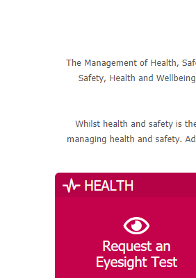
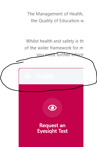
We paid an external party create these icons and banners based and it took a lot of time to get the dimensions right. We can't just have these changing. The page still has a whole bunch of differences.
Current Page
Preview Page
I see the preview ends in 4 days. Can you confirm this means the preview goes and not that the preview will become live. We have only just gone live with this portal this week and to have it change even in such minor ways undoes a lot of the work and effort we have put in.
Hi @AndyHill,
There is a new update of Preview already with several fixes. Can you please have a look and see if there are still issues?
We are aware of the issue with the text in the footer not displaying and that will be fixed ASAP.
Please let me know if there are any other issues.
Regards,
Daniel.
-
Hi @AndyHill,
That will show if the user is the owner of one or more domains. Is defined in the Administration, Service Domains.
Regards,
Daniel.
-
On 7/23/2021 at 1:40 PM, Alisha said:
Just a few things we have noticed with the new UI.
- If there are 9 items in the HUD, the last item will get cut off.
- On the Timesheet, the clock positioning is slightly outside the box.
- In the Employee Portal, we have set the links to 'No Background'. However, in the new UI, there is a grey background.
HI @Alisha,
-
If there are 9 items in the HUD, the last item will get cut off.
- It will be fixed in our next Preview release
-
On the Timesheet, the clock positioning is slightly outside the box.
- Will be fixed as part of our next Board Manager build
-
In the Employee Portal, we have set the links to 'No Background'. However, in the new UI, there is a grey background.
- The background colour is applied to the entire background of the tile. What you see here is part of our new design and it applies to the icon only using the same icon colour with some transparency.
Hope it makes sense,
Regards,
Daniel.
-
 1
1
-
-
-
On 7/22/2021 at 6:07 PM, Dan Munns said:
@Dan Munns we are working on a separate build of Service Manager and other apps that will include fixes and improvements to the app. It will be pushed to Live a short time we push Core to Live.
Regards,
Daniel.
-
Hi @chrislord,
You are right, it is better with columns. We have done that change and will be in Preview soon.
Thanks,
Daniel.
-
 1
1
-
 1
1
-
-
Yes @Martyn Houghton,
We've fixed this already. Will update preview soon with the fix.
Cheers,
Daniel.
-
 1
1
-
-
Hi @Martyn Houghton,
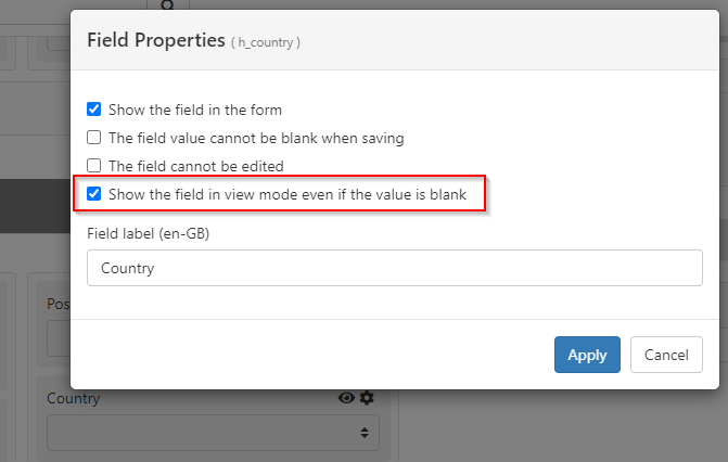
I can see the problem. From what I can see, it happens is the field is a Combo Box and is set to be displayed even if the value is blank.
Is that the case?
Thanks,
Daniel.

-
Hi @Chris Bardell,
Don't worry, is not you, is us ;-) . Can you please have a look at our new preview. I believe it has been fixed there.
Thanks,
Daniel.
-
Hi @AndyHill,
We can reproduce the issue. Will be fixed in the next build.
The issue is that you've left the "name" field empty and added description. As a workaround you can move the description to the name.
Kind regards,
Daniel.
-
Thank you for giving us the feedback.
-
Request list: there is a lot of spacing now, which helps to read it better, but in the previous view I had under control more data at a glance, in terms of columns I see an additional column (not a great difference but useful, this might be due to the new left bar) in terms of rows the new UI offers around 15 request the old about 21 rows.
- As soon as we release to Live the Preview we will release several builds for individual applications such as Service Manager to match the new style.
- In this particular case (table of requests list) it will be improved soon in our next preview build. Text will still be slightly bigger as we've increased from 12 to 14 pixels, but the space between rows will be smaller, so it will look much better.
-
I really use a lot the menu next to the icon which seems to have disappeared or better moved to the left bar
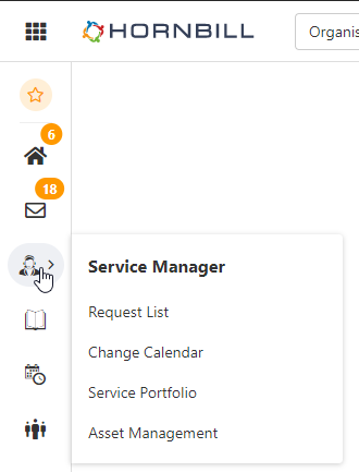
- That's what we used to call the title menu. It was introduced back then because the main menu was too complicated to open the same options (too many clicks). Now you can simply get the same menu by clicking on the menu option. So there is no need to duplicate the functionality anymore.
- Regarding the dark mode, yes, there are still issues in some application and we will look in to that too.
Thanks again,
Daniel.

-
Request list: there is a lot of spacing now, which helps to read it better, but in the previous view I had under control more data at a glance, in terms of columns I see an additional column (not a great difference but useful, this might be due to the new left bar) in terms of rows the new UI offers around 15 request the old about 21 rows.
-
14 hours ago, Alisha said:
Hi @Daniel Dekel,
Just following up to say that this now works for us. Our Networks team checked and they couldn't see that anything was being blocked. Anyway, it's great that it's working for us now, thank you.
Great to hear @Alisha ;-)
-
-
First, thank you for you for your feedback ;-) This is the right place. Shortly a college of mine will answer to your questions.
Regards,
Daniel
-
Hi @Adrian Simpkins,
That is true, but we will soon (later on today) roll out a change for it, so it will apear also if you have Harry Hornbill notices. So more people will be able to see this.
Thanks,
Daniel.
-
 1
1
-
-
@Alisha, one more question. Is it only you that experiences the issue or everybody in your company? Is it only from your network or outside your network too?
Thank you,
Daniel.
-
Hi @Andy,
What in what widget do you see it? Is it the services widget, the links one?
Also, are you using it in the new Preview or Live?Thanks,
Daniel.
-
Hi @Alisha,
At the moment we can't find any issue and no other customer has reported a problem accessing the preview. Is there a chance you have some network filtering in your side?
The preview is in the domain https://preview.hornbill.com/YOUR_INSTANCE
Thank you,
Daniel.
-
 1
1
-
-
Hi @Alisha,
It has nothing to do with the Employee Portal. It should work for all.
Is strange, what browser are you using?
Thanks,
Daniel.
-
Hi @Alisha,
The Hornbill Administration came out a bit earlier than expected but we still require a build of Hornbill (Core UI) to use this.
I expect this to be in about two-three weeks time.
Regards,
Daniel.
-
 1
1
-
-
Hi @Shamaila ,
I can't reproduce the errors you've mentioned. Can you please provide some screenshots and steps to reproduce? Also, what operating system do you use and what browser and version do you use?
Thank you,
Daniel.





FAQ Formatting
in Employee Portal
Posted
@Paul Alexander I can see the problem. We'll fix this and push it with our build on Wed.
Regards,
Daniel.