AlexOnTheHill
-
Posts
204 -
Joined
-
Last visited
Content Type
Profiles
Forums
Enhancement Requests
Everything posted by AlexOnTheHill
-
While developing a new set of SLAs I encountered the necessary calculation to work out the correct number of days and was able to revise my count of hours and days accordingly. Given that we already define what a working day is can we add the ability to see the number of days based on our working hours? When talking through the new targets for each of the priorities and request types it is hard to tell what any figure means without additional calculation. I presume the reason for this is that users may be operating on different working time calendars but I still think there should be a way to link the two.
-
Team Lead Notifications for High Priority Requests
AlexOnTheHill replied to AlexOnTheHill's topic in Service Manager
Thank you @Jim this looks very useful indeed, every day a school day was never truer! -
Hello, I have been asked to look at the possibility of notifying Team Leaders when a request is logged as a High priority. I have explained how I would be able to do this within a workflow but there is a risk that the notification would not be sent depending on where the request is in its flow. For example, if a request were reopened and reprioritised it would have moved past the point where the priority was checked. I could similarly create a button for High Priority which defines the priority but also emails the Team Leaders with the details of the request. I have suggested creating a custom view showing all high priority requests, I have also suggested a daily report email flagging high priority requests. Are there any more elegant solutions for this where I can say whenever the prioritisation is set to high regardless of where a request is in the flow that the team lead gets a Hornbill or Email notification? Updating the workflows would be a large piece of work to undertake and still have the possibility of reprioritised requests not generating notifications or indeed counter to that, incorrectly prioritised requests generating too many notifications. Is there anything here I haven't considered? What would the recommended practice be here?
-
Preview new User Interface for Core UI
AlexOnTheHill replied to Daniel Dekel's topic in Collaboration
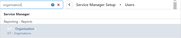
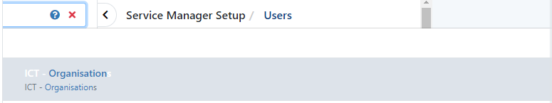
I just noticed a formatting issue when using the admin portal search in portrait view, the new view pushes the search bar off screen to the left and the results lower down the page are cut off. There is a scroll bar set to the centre of the screen but if I use it to scroll and move the mouse I am returned to the page prior to the search results. I have replicated this in chrome and edge so I don't believe it to be a cache issue. Current Hornbill: Preview:
-
Looking good here also. Thank you for the quick turnaround.
-
This has impacted us too, currently unable to see global sub-statuses
-
Assets Auto Tasks and differing on Linked Assets
AlexOnTheHill replied to Jim's topic in Service Manager
I have been asked to look at making the addition of an asset mandatory for all requests. As part of this a point has been raised that we already know the asset given the service selected or capture options picked and with that being the case I was looking to see if the workflow can add the asset automatically in those instances. I was also considering creating an autotask to link the most frequently used assets to a request. This would be especially useful as today as a consequence of a major incident there have been approaching 100 incidents raised against a specific software asset and I would like the ability to link that asset to each of the requests in one action rather than 100. I can see how to link an asset within a request itself however linking an asset from the Workflow doesn't seem to be an option or am I overlooking this option? Note that the users are not the owners of the asset, only users. Any help would be appreciated. -
Preview new User Interface for Core UI
AlexOnTheHill replied to Daniel Dekel's topic in Collaboration
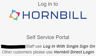
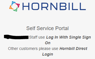
The squeezing of the horizontal space has also affected our login screen forcing single lines of text to spread to two lines: Current: Preview:
-
Preview new User Interface for Core UI
AlexOnTheHill replied to Daniel Dekel's topic in Collaboration
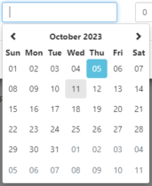
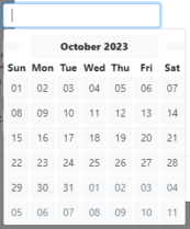
I mentioned previously about the poor alignment of the input fields in the date selection for reporting but I had failed to click on the date selection. The preview has a blank icon for backward and forward either side of the month and no longer highlights the current day. Current: Preview:
-
Preview new User Interface for Core UI
AlexOnTheHill replied to Daniel Dekel's topic in Collaboration
Just a little addition to this is that not only does the heading not collapse but when you raise subsequent requests they remain expanded. I expanded one section with a large number of subcategories and was stuck scrolling through them on each request I resolved afterwards. I think a force refresh would probably have fixed my issue but I thought this was still worth highlighting. -
Preview new User Interface for Core UI
AlexOnTheHill replied to Daniel Dekel's topic in Collaboration
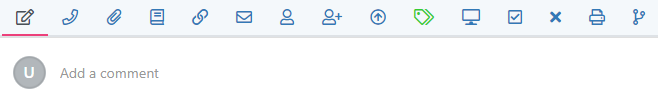
When adding an update to a request I now get a U to the left of the comment: It gives the impression that I am a user with the initial U This is also not consistent with any of the other actions
-
Preview new User Interface for Core UI
AlexOnTheHill replied to Daniel Dekel's topic in Collaboration
Thank you, I would say that removal of the less button has caused confusion, I've had people reach out to me from the organisation asking where it has gone and my answer has been to refresh the page which seems less than ideal. The more button is an improvement, certainly but its prominence highlights the absence of the less button. -
Preview new User Interface for Core UI
AlexOnTheHill replied to Daniel Dekel's topic in Collaboration
I have noticed also that if you have an email in your timeline and click show more there is now no button to show less -
Preview new User Interface for Core UI
AlexOnTheHill replied to Daniel Dekel's topic in Collaboration
The user list suffers from being used in portrait mode in the preview Current: Preview:
-
Preview new User Interface for Core UI
AlexOnTheHill replied to Daniel Dekel's topic in Collaboration
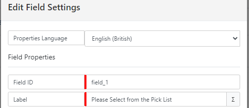
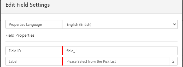
The pattern of squeezing the display horizontally seems to be consistent everywhere I look. Here's how Intelligent Captures compare: Current New You will see that the language drop down no longer matches the height of the Properties Language too. All these areas that are being compressed are the space where agents and administrators do most of their work. This is where I would make space available for, not remove space from.
-
Preview new User Interface for Core UI
AlexOnTheHill replied to Daniel Dekel's topic in Collaboration
I checked self service to see if there were any changes and it looks like catalogue items can now overflow and have also been squeezed horizontally: Current: New:
-
Preview new User Interface for Core UI
AlexOnTheHill replied to Daniel Dekel's topic in Collaboration
I've noticed that emails in the sent items now take up roughly twice the vertical space too: now Another example of being squeezed horizontally and expanded vertically. I checked I can see 14 emails per screen currently and 8 in the new layout.
-
Preview new User Interface for Core UI
AlexOnTheHill replied to Daniel Dekel's topic in Collaboration
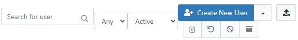
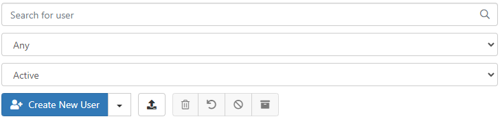
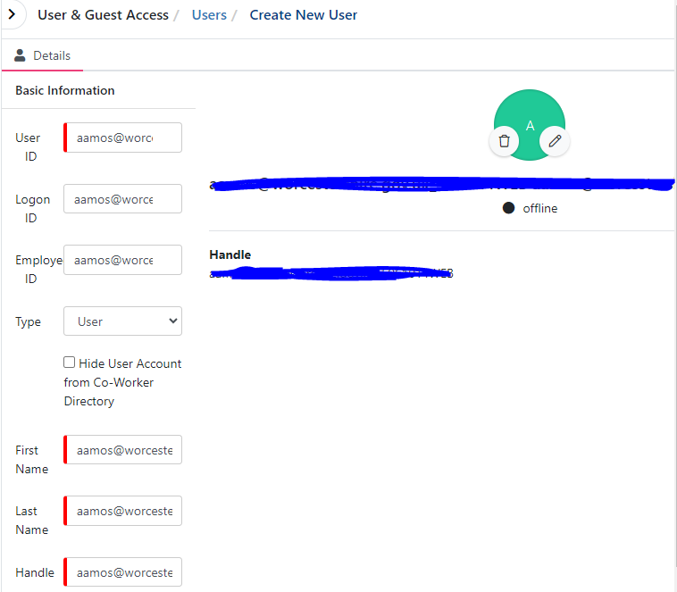
@Daniel Dekel Thank you. Yes, this is how I am creating new users. New users are created with a combination of the email address and employee number. When I create a new user manually I paste the user ID into the logon ID, employee ID, first name, last name, handle and email. I then trim out the information I do not need from each of the respective fields. This may seem counter intuitive but it's a fast and accurate way to manually create users compared with typing each field manually. The result of doing this is as I described, the preview squeezes all the fields to roughly 1/5th the screen on the left with the preview taking all the rest of the space. If anything should be squeezed, it is the preview.
-
Preview new User Interface for Core UI
AlexOnTheHill replied to Daniel Dekel's topic in Collaboration
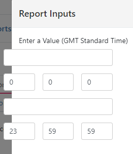
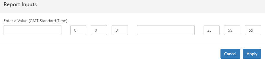
I'm just taking a look at reporting also and the same horizontal spacing issues are evident there too. Here's the date selector: now
-
Preview new User Interface for Core UI
AlexOnTheHill replied to Daniel Dekel's topic in Collaboration
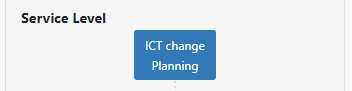
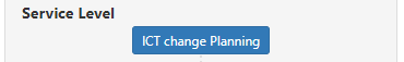
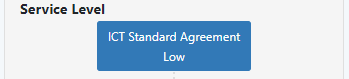
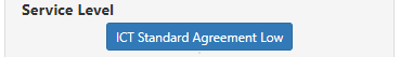
I noticed that the right hand column in a request showing the request type, service, activities and members has also been squeezed horizontally, causing SLAs to now show on two lines instead of one: now now
-
Preview new User Interface for Core UI
AlexOnTheHill replied to Daniel Dekel's topic in Collaboration
Creating a new user in the preview now has a preview of the user as you create them and this too messes up the horizontal spacing. I create users in a portrait view monitor and the user preview takes priority for horizontal space so I am left entering details in a fifth of the left hand side of the screen. I can't even minimise the preview. -
Preview new User Interface for Core UI
AlexOnTheHill replied to Daniel Dekel's topic in Collaboration
First few hours of taking a look and there are some things I like and some things I really don't like. Good things: love the consistent colour coding of the request type when opened I also like that areas that should be in the background are pale blue, directing the eye toward the areas of importance. Bad things: spacing, everywhere, the spacing: the massive blank horizontal left and right hand panels when viewing a request the double spacing between actions when viewing a request the double spacing between email templates the double spacing between snippets the double spacing between the from, to, cc and bcc The actions in a request is now against a faded blue background with a red underline, it is no longer white so feels part of the background. Change post visibility not working Closure category is now in black not blue, making it appear that it cannot be clicked. Customer name seems faint compared to the word customer My largest concern is that the formatting of the page in service manager hasn't been executed well. Almost the entire user base will be in landscape mode on a 16:9 /4:3 screen ratio so I see no reason to revise the layout without that in mind. It's not even taking the same horizontal space that it did before, it's using less. The culmination of the changes seems to be to squeeze the part of the screen where most users will be concentrating on, forcing it to extend vertically. Those are my initial thoughts anyway and I'm sure plenty of people are making many of the same observations. -
That's it! Brilliant! Exactly what was needed! What you've done there makes sense too. Thank you for the explanation.
-
I didn't make any headway with this one sadly. I had hoped there would be something in h_sys_accounts but there isn't. The groups are under h_sys_account_groups and the group types are under h_sys_groups so you'd need to link each of these. I'm terrible at SQL but I was able to create a quick search on database direct: SELECT * FROM h_sys_account_groups JOIN h_sys_groups on h_group_id = h_id WHERE h_user_id = '[enter ID here]' AND h_type = '2' That shows me if someone has got a department, now I think we just need to find the inverse of that
-
I would add that while I am able to manually take calls off hold the affected requests did not come off hold automatically.