Berto2002
-
Posts
1,267 -
Joined
-
Last visited
-
Days Won
28
Content Type
Profiles
Forums
Enhancement Requests
Everything posted by Berto2002
-
 We're successfully using the API scheduler to log Requests. Now to do Change Requests... Using this: Operation - com.hornbill.servicemanager::ChangeRequests/logChangeRequest I created my JSON file but then I realised that change scheduling is a different page: Operation - com.hornbill.servicemanager::ChangeRequests/schedule Question: can I append the fields from the ChangeRequests/Schedule to the initial list of parameters in the JSON file so the Change gets scheduled when first logged? Or do I have to complete once operation, receive the RequestiD and then have another operation to update the CR with the Schedule details?
 -
Thanks. Then I will wait and likely still want to use that General OU type for my purposes.
-
Yes I get the same issue when using a link (https://docs.hornbill.com/esp-fundamentals/core-capabilities/organization-and-teams

-
@Steve Giller is there is list of restrictions by Org Type in the documentation for allowed uses? Why design this restriction; why not let us customers decide what users and roles and organisations we use groups for. I have loads of functions all over the wider organisation and I cannot use the Function Org Group for them.
-
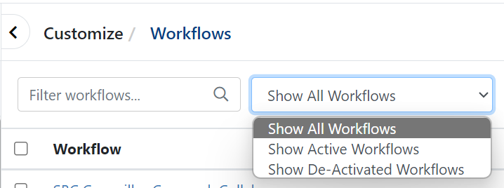
The selection I make in the Workflow filter is no longer retained by the system and defaults back to "All workflows" each time the tab/browser is closed. For the last 2.5 years I have had that set at "Show Active Workflows" (Show Active BPM) which is what I need 99% of the time. Please can we have this drop-down reverted to store/save the preference? It's the same in the old/new UI so this is not a UI issue but maybe altered with the SM release when the name was changed from BPM to Workflow?
-
I created an Org Group of type Function and the only members I can add are Full Members. Is this intended? Use Case: I have a bunch of people in the wider organisation forming a function of approval of mobile phones so I wanted to use that OG Type for Basic Users.
-
Thanks both. I thought that was the case I guess.
-
@AlexOnTheHill 100% with you here. This UI update is a backwards step in terms of useability and agent productivity with overall reduction of useful information on screen at any time, additional unnecessary clicks and wasted screen real estate.
-
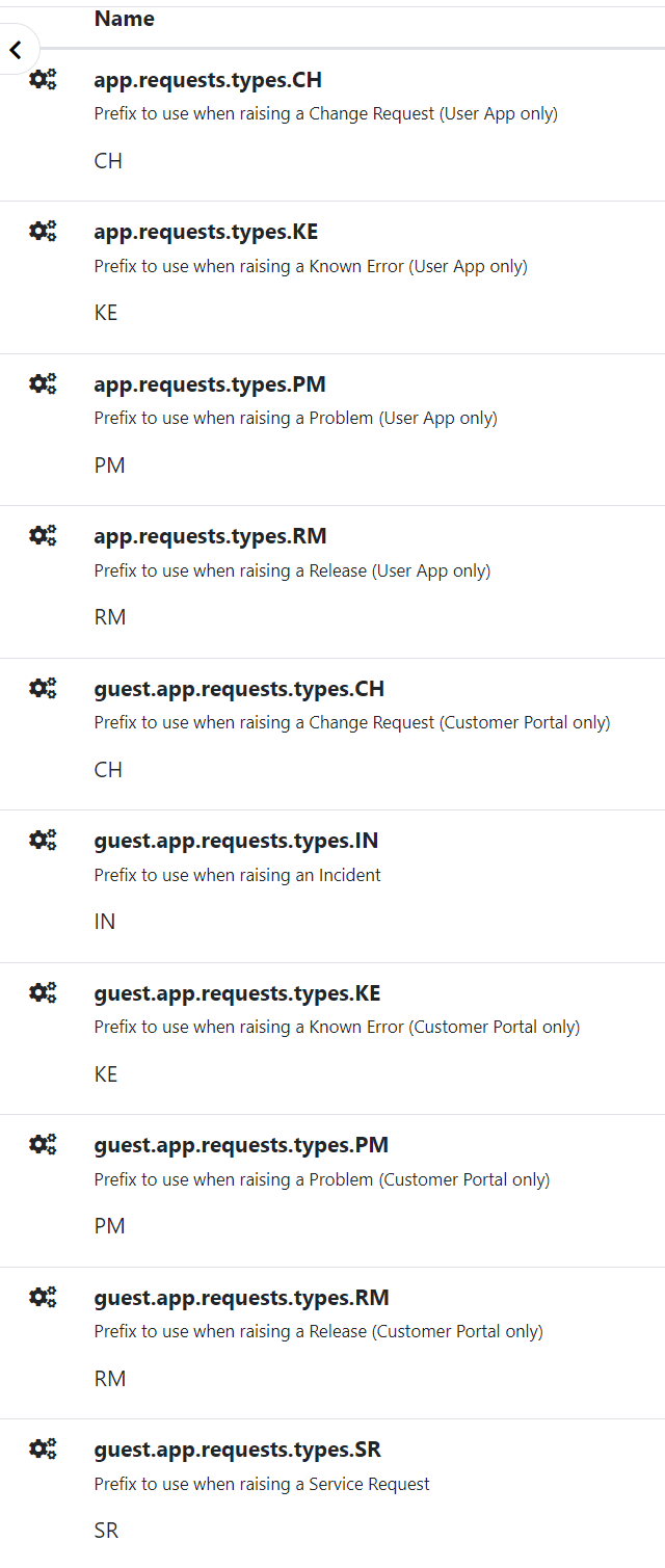
I can see settings for how to alter (what I call) the request reference prefix (IN, SR, etc) for the 5 specific request types. What I cannot see is whether it is possible to have other additional prefixes. For example, I would like some of our SR requests to be CS (for Case) at the start; but they would otherwise be normal SR's in all but name. Is this possible? I'm struggling with finding anything in the documentation in this area - largely because I don't now if I am searching the correct term... 'prefix'? Thanks for any advice.
-
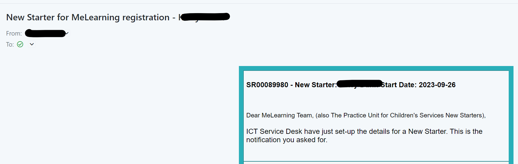
@Dan Munns you should log here: I suspect HB should shut this thread as duplicate for above.
-
Yes there's a few of these (see above for my post on the global search bar now being a magnifying glass icon you need to click to expand before entering the data). I'm overall impressed with the visuals but I think HB have not prioritised user productivity and usability; the amount of useable data on the screen throughout these updates has reduced and the number of clicks and scrolls is increasing. I really wanted to see more relevant information for analysts presented on page 1 of any required update, reducing clicks and scrolling. When opening a Request, the analyst needs to assess "what is the required outcome and what do I need to do next"; all that information should be cleverly displayed once the page loads and they should not need to hunt for it.
-
Sorry but I really do not like the new email UI. 1) Our email header graphics are missing when viewing the emails in the new Email UI: Old UI: New UI: 2) In the above, the To is not showing. We have to click on the twistie to see who it went to which is no good: 3) you've spaced it all out too much again so the list of emails in any mailbox is now only showing a few so we have yet more scrolling and clicking to get the data! You've reduced the amount of usable data on the screen; reducing productivity of all HB users. I used to be able to see 12 emails in the list (including preview) before scrolling but I can now only see 6 (with the preview open which is essential to read what the email is about): a 50% reduction in the amount of usable data on the screen . And the list of emails is 50% narrower and cannot be resized.
-
There is a search function of course; just start typing. but it doesn't help people who don't know what they are looking for. There will also be (soon) the ability to limit which templates show here so all the back-end ones can be hidden from analysts). but that doesn't excuse all the unnecessary extra line gaps in a basic list
-
Not a fan of all this unnecessary spacing in the new email view and drop-down for email templates, Just more scrolling for everyone. I am not sure HB have really thought about the amount of scrolling necessary over-all to manage tickets. The mission should be more usable information per page not less?
-
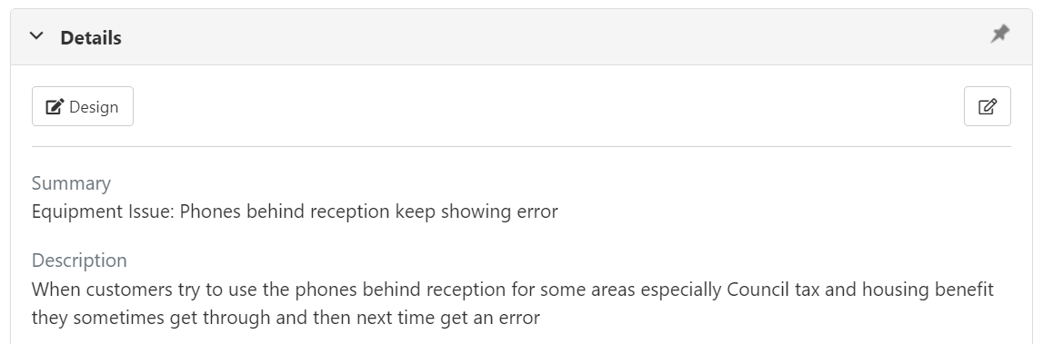
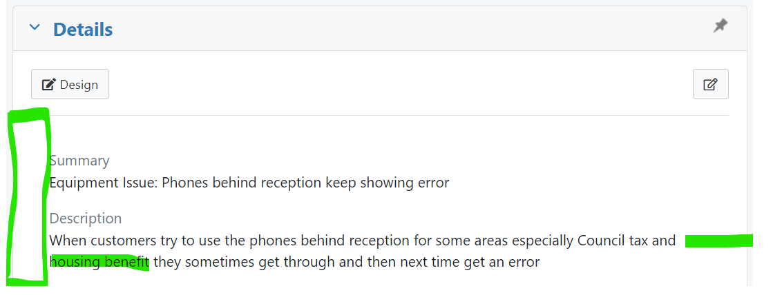
The Request main view has been made yet narrower when it was already too narrow in my opinion. Was width reduction in the requirements or requested by customers? If not, why has it been done? a) Using a measure on my screen at set zoom, the Details section is 17.4cm wide in old UI and 16.4cm wide in new which is a 6% reduction in width b) The Details box has bigger margins to which, on the same relative scale means the Old UI text width in Details was 16.4cm but it's now only 15cm which is a 9% reduction in width Old UI: New UI where the words "Housing Benefit" have scrolled to the new line" because a) the Request width has been reduced b) the margins inside the collapsible sections have been made wider As a result, most tickets now required excessive scrolling. I request all the widths go back to at least where they were or preferably larger or intelligent width depending on browser (like most other systems in use these days).
-
I don't like the fact that the new UI has a collapsible search area. We use the search ALL THE TIME but this change has just given us all an additional click every time we want to search for something. This is a productivity loss for all HB customers. There is no gain to hiding the search because there is nothing else on that layer of the UI to clear space for. I request reverting this to permanently displayed search bar: old: new
-
+ 1 we have this problem; big issue for customer relations; we must be able to hide if mistakes made.
-
+1 Action bar icons must be one line. Relates to the fact the Request display panel is too narrow.
-
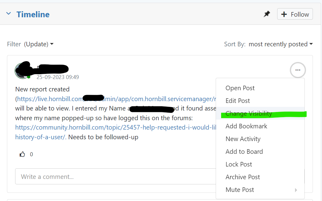
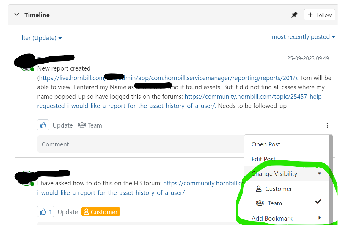
I placed a post on the timeline but cannot alter the visibility. The sub-menu from the Change Visibility selection in the selection box is not visible and clicking on Change Visibility itself does nothing. I note that Mute Post does have the sub-menu. The same Request in the old UI: BTW Bookmark is also missing the sub-menu. This is a showstopper. Service Desk must be able to to change visibility
-
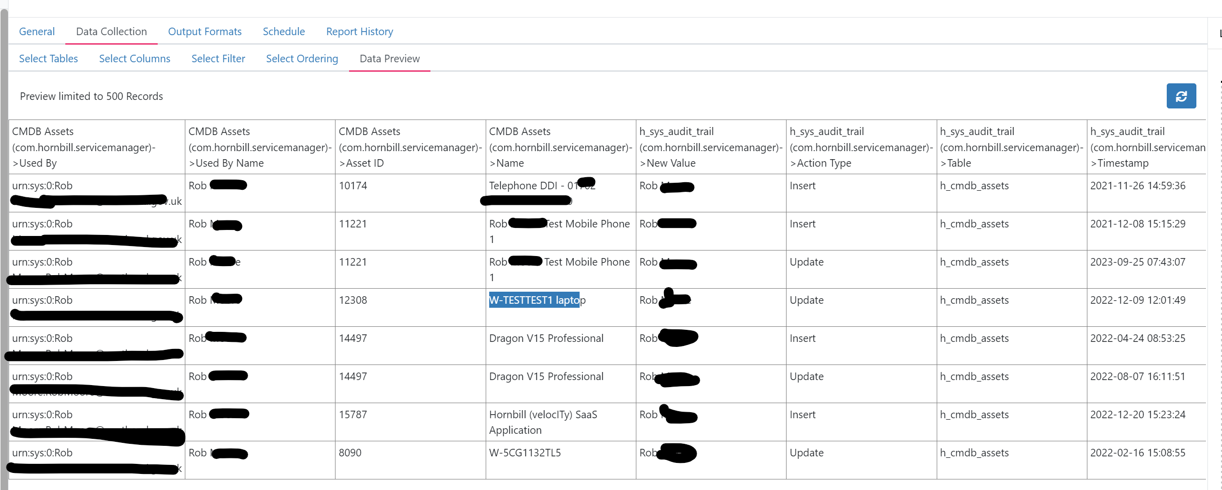
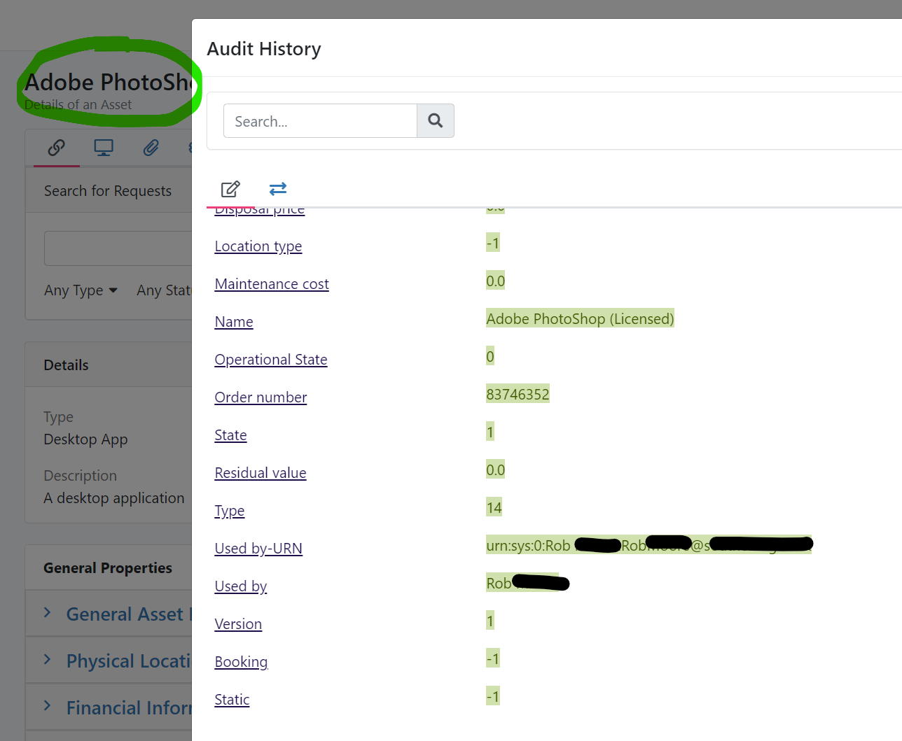
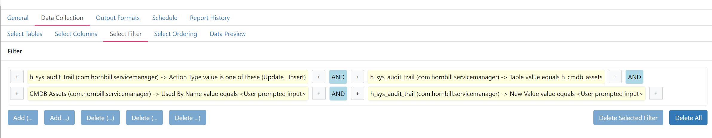
@Met thank you this helps. I got a report started. I have an anomaly though. When I initially ran it, I had 8 rows. I then found an old asset I used to have and re-assigned it back to myself and two rows appeared. One was the new Update row and one was the original Insert row which had not previously been listed. In other words, it only displayed the Insert row after an Update row was added. In other words, the report could be missing Insert Data. I do note that there is a row for an Asset which is Insert only so this is not a cut and dry situation. Just asking if you can see a reason for this in the structure. No Adobe InDesign showing at first: Then two rows appear and the Insert row is the date the record was created with me as Used By but which was not previously showing: I have another example which I have not yet edited. This Adobe Photoshop asset is not showing in the report but it was created with me as Used By (2022-06-16 10:51:32) These are my filters: I am using my Name as the search although each entry does also match with the same URN also. A mystery?
-
How are you effective with workflows on 1080? I really like to see it all on the screen so I can move about without endless scrolling. Get your boss to give you a 27" 4K
-
Sorry, that string is not found on my browser (Edge) and I don't understand this feature enough to do more: But yes, I use a big monitor; but then we're IT professionals. Yes, the stats on the web for "popular monitors" show 1080 for the population at large but in IT where our analysts are, these people are buying ultrawides and 4K for gaming and using them for WFH. Our tools have to cater for IT people, not my granny
-
I don't like the fact that the new UI has a collapsible search area. We use the search ALL THE TIME but this change has just given us all an additional click every time we want to search for something. This is a productivity loss for all HB customers. There is no gain to hiding the search because there is nothing else on that layer of the UI to clear space for. I request reverting this to permanently displayed search bar: old: new
-
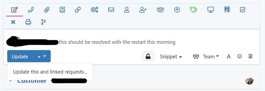
I have a double arrow on the Update Request button but there's only one action:
-
@Kelvin I was informed on Monday this week that this issue, "KE00178558" would be fixed in the release we had this week: .. but I cannot see any reference to it in these release notes. @Nanette would appreciate clarity please or @Steve Giller.