Jump to content

Samuel

Hornbill Users
  • Posts

    2
  • Joined

  • Last visited

Posts posted by Samuel

  1. 20 hours ago, Claire Holtham said:

    We asked for feedback from our users. Can I pass on this particular feedback from one of our ICT staff members which has useful accessibility perspective: 

    I would like to express concern regarding the new Hornbill UI from an accessibility point-of-view.

    Hornbill's previous UI update in 2021 made accessibility substantially worse compared to the pre-2021 UI, so I was eager to try the new 2023 UI in the hope that this improved things. Unfortunately, this is not the case - in fact it is even worse.

    I have bad vision, therefore I used larger text and DPI scaling. I acknowledge that this makes some applications display incorrectly, but generally speaking the vast majority of common applications are completely compatible with it (e.g. Outlook, Teams, Slack, GitLab, Azure, etc).

    Below is a screenshot from a full-screen Microsoft Edge window running on my 1920x1080 screen:

    As you can see, the interface is big, bloated, poorly scaled, and makes very inefficient use of screen space.

    There are large left/right margins which cannot be removed, the call action buttons are wrapping onto two lines, the text sizes are seemingly random, and tab navigation is completely unintuitive.

    Further to this, the dark mode does not seem to have been worked on, as the colour scheme is incredibly garish and inconsistent, with aggressively contrasting colours (e.g. jungle green buttons on a midnight blue background).

    I understand that this is a 'preview' of the new UI, therefore I want to raise these issues as soon as possible.

    Please let me know ASAP that these issues are going to be resolved prior to the new UI going live.

    I am keen to be involved in any feedback sessions/user testing.

    feedback.png

    Fully agree with all of these points. In addition, I've been collating feedback from my IT colleagues and, even for those of us with normal vision, there are text elements that are now very hard to read in light mode (e.g. section headers in Service Manager) and dark mode (e.g. any link text on an unviewed ticket that's highlighted blue), as well as any of the text that appears on the light-blue-grey background in the request list being generally more difficult to read than it was before.

    For colleagues who use a screen tint to make it easier to read text, the change from a white to an off-white background means they're left looking at a muddy mess. Dark and high contrast modes don't help here as the tint isn't effective on a dark background either. 

  2. Hi folks,

    +1 for a Utility to do this, if it isn't already in the works now. 

    I've got a similar need - a repeated BPM loop that needs to trigger if a request is taken off-hold more than X times - and also figured that a loop counter would be the best way to do so. 

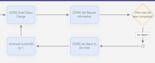
    The resulting loop looks like this: 

    image.png.2eb84c312ce7169206bd4cea22ddcedf.png

    I've tried to use the method that @samwoo suggested, i.e. using &[global["flowcoderefs"]["getReqInformation"]["customField30"]+1]

    However, the behaviour I get is completely different - it simply appends a 1 to the string, so that a loop progresses as 0, 101, 011, etc. 

    Do either of you still have these loops implemented and working and if so, any idea what I'm doing wrong?

    Thanks!

    • Thanks 1
×
×
  • Create New...