KrisReynolds
-
Posts
5 -
Joined
-
Last visited
Recent Profile Visitors
4,021 profile views


KrisReynolds's Achievements
")


-
That'll be down to the UI update -
-
I might be missing it, but I can't see any resend buttons in the mailbox... is there one hiding somewhere, or do we need to go back into each case and resend that way?
-
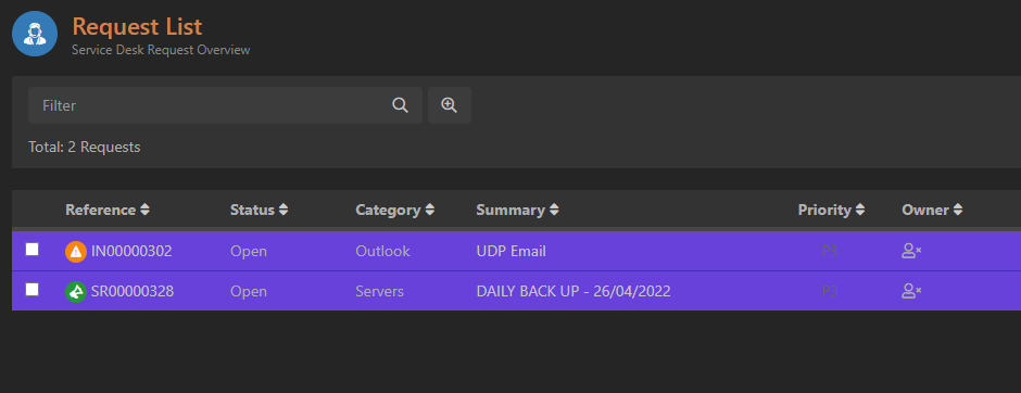
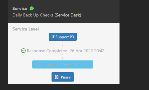
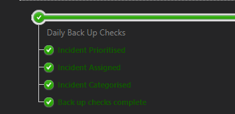
Would it be possible to get some changes made to dark mode to make it a little more usable? Items in lists display as black text which is unreadable until hovered over In the progress bar, green text is hard to read on the dark background Highlighted cases are very bright Service level info seems to have a light background but the resolution date is difficult to read