Claire Holtham
-
Posts
136 -
Joined
-
Last visited
-
Days Won
5
Claire Holtham's Achievements
")


-
Preview new User Interface for Core UI
Claire Holtham replied to Daniel Dekel's topic in Collaboration
New issue with forwarded emails- Timeline incomplete. If I open an email from the call timeline, and forward it on with the thread included, plus some new text. Then I send it to the customer & I include our service desk. I'd expect it to not only email out the customer, but also update the timeline and append the email to the call. What it does is: append the email to the call (all of it), email the customer, but, it only partly updates the timeline - on the timeline it shows the forwarded text, but not the new text I added. I hope this is clear... -
Preview new User Interface for Core UI
Claire Holtham replied to Daniel Dekel's topic in Collaboration
Excellent news - thanks Daniel! -
Preview new User Interface for Core UI
Claire Holtham replied to Daniel Dekel's topic in Collaboration
Thanks Miro, - I'll let our service desk know it will be fixed in the next core UI release - do you know if that will be before 2nd April please? -
Preview new User Interface for Core UI
Claire Holtham replied to Daniel Dekel's topic in Collaboration
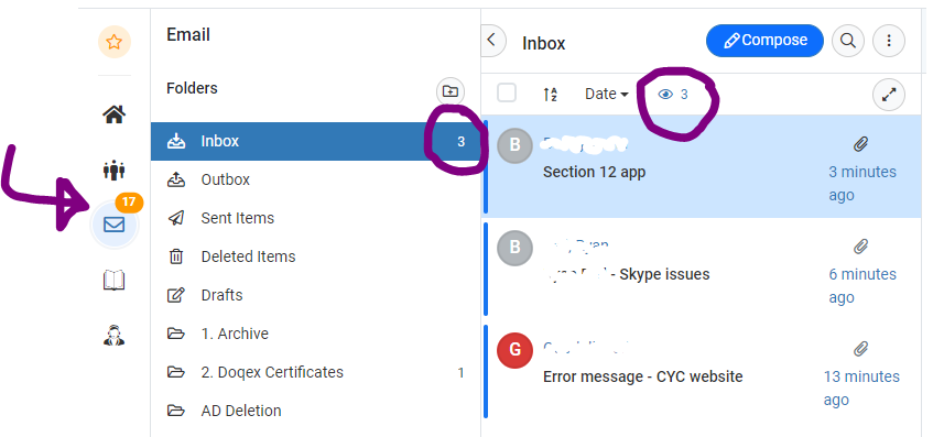
Hi Daniel, we've noticed there is a mismatch between the total number of mail items showing on the left, and the actual number in the inbox on the new UI only. An f5 to refresh the screen corrects this. so it's an annoyance for our first line staff who dont want to constantly be refreshing hornbill to see that there are new items in the inbox that require attention. Cheers, Claire
-
Since we're all being forced to the new UI on 2nd April we've been asking early adopters how they've found it. biggest issue is that when you reply to an email on the new UI there is no longer the option to include the previous thread, on the old UI we had access to the 'quote' button which did this for us On the new UI the work round is (apparently) to forward the message instead, but then you have to enter the mail addresses again, so is not ideal. Our First Line staff use this all the time. Do we know if this will be included in a Core UI release before 2nd April please? Cheers, Claire
- 1 reply
-
- 1
-

-
Preview new User Interface for Core UI
Claire Holtham replied to Daniel Dekel's topic in Collaboration
+1 here too. I might raise this on a new thread, now that we're being forced onto the new UI on 2nd April... -
Ooh, that should work. I'll have a play. Thank you!
-
Hi - I want to provide a simple report via the Document library, which just has all the user id's on it. So that certain staff can search it to see if user_id's are in use. However the line limit set on our reports is 3,000, and whereas I could set it to 10,000 I would be concerned that would impact on the performance of the system in general. If it was possible to publish the report, with a prompt on it, so they could run a prompted version of the report (and it would bring back just one line) that would be a great solution. Is there some way of doing this - either on the library of documents, or on a widget? cheers, Claire
-
Preview new User Interface for Core UI
Claire Holtham replied to Daniel Dekel's topic in Collaboration
We asked for feedback from our users. Can I pass on this particular feedback from one of our ICT staff members which has useful accessibility perspective: I would like to express concern regarding the new Hornbill UI from an accessibility point-of-view. Hornbill's previous UI update in 2021 made accessibility substantially worse compared to the pre-2021 UI, so I was eager to try the new 2023 UI in the hope that this improved things. Unfortunately, this is not the case - in fact it is even worse. I have bad vision, therefore I used larger text and DPI scaling. I acknowledge that this makes some applications display incorrectly, but generally speaking the vast majority of common applications are completely compatible with it (e.g. Outlook, Teams, Slack, GitLab, Azure, etc). Below is a screenshot from a full-screen Microsoft Edge window running on my 1920x1080 screen: As you can see, the interface is big, bloated, poorly scaled, and makes very inefficient use of screen space. There are large left/right margins which cannot be removed, the call action buttons are wrapping onto two lines, the text sizes are seemingly random, and tab navigation is completely unintuitive. Further to this, the dark mode does not seem to have been worked on, as the colour scheme is incredibly garish and inconsistent, with aggressively contrasting colours (e.g. jungle green buttons on a midnight blue background). I understand that this is a 'preview' of the new UI, therefore I want to raise these issues as soon as possible. Please let me know ASAP that these issues are going to be resolved prior to the new UI going live. I am keen to be involved in any feedback sessions/user testing.
-
Ditto here, will look out for the improvement.
-
Pause Until Date/Time - default?
Claire Holtham replied to Claire Holtham's topic in Service Manager
thanks Steve! (Obviously +1 for the enhancement from us too) -
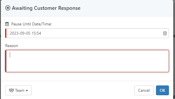
Afternoon, We use substatus' to put a call on hold, and for it to come off hold again after certain period of time. I'm now being asked if there is a place to set the initial value in the sub status 'Pause Until Date/Time' - they would like it to default to, say, a day in the future, rather than right now. Is there somewhere to set that, (I could not see the setting myself)
-
Emails attached to calls have a rogue > added to any urls
Claire Holtham replied to Claire Holtham's topic in Service Manager
HI @Steve Giller - what's the best way of seeking answers on this question? (I'm sure me putting an 'any update' question on this forum will get pretty tired pretty soon) -
Morning, has anyone noticed hornbills availability being a little up and down more so than normal over the past few weeks? My colleague who works in first line (so uses Service manager constantly) rang me to say it was down 8:51 (for him and at least one other colleague), but by 8:53 when we re-tested it was back up again. I've never noticed it myself (being a slightly less intensive user of the system). He said that this happens periodically (and is most frustrating when he has a customer on the phone, that he's taken all the details of a case but cannot save it - he gets a red message of death saying something like 'could not update instance'). I trust him when he says this has happened more frequently recently, and wanted to know if other sites had similar experience? Thanks Claire
-
Emails attached to calls have a rogue > added to any urls
Claire Holtham replied to Claire Holtham's topic in Service Manager
@Steve Giller do you know if this issue has been reviewed by development yet?