Hi all and thank you for the fantastic job! I concur with the comments and suggestions of @Lyonel and @samwoo .
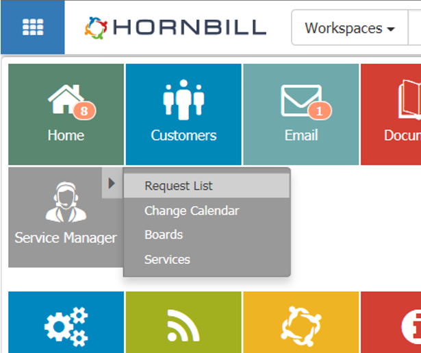
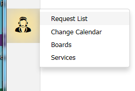
I use Hornbill as a support analyst and the first thing that disturbed me in the new interface was the that the menu on the left disappeared, and that it takes 2 mouseovers and 1 click to go back to the Requests List. In the previous version it took one mouseover and one click, which is to me one mouseover too many. Ideally a shortcut would bring me back to my requests list in a blink (pre-loaded). I am making a point about the Requests List because this is the headquarter of support analysts. And about shortcuts too because even though we are a generation of mouse/icons clicking/fingering, it is still quicker to use shortcuts.
New version:
Actual version:
Sorry for the harsh feedback, but I like things to be very handy, quick and straightforward - which seems to be the mindset of Hornbill too. Also don't take me wrong the new interface looks very promising !!
I can see that in the new version there is still room available on the left for a menu. Maybe you have plans to put something back there but also that would be interesting just to gain this space to maximize the used space on screen. Then what about a "Favorites" menu, in a tab on the right ? That would be handy.
Best regards,
Max


")


 max_crown changed their profile photo